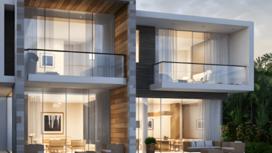
Choosing the right colours can significantly enhance the appearance and ambience of one’s living space. With so many options available, a paint colour chart is helpful for anyone wishing to update their house or place of business. Here are strategies for selecting the perfect hues to bring walls and spaces to life.
Understanding the Basics of Colour Theory
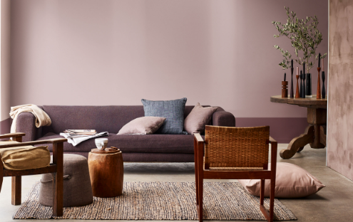
The first step in selecting the right shade involves a basic understanding of colour theory. When utilised carefully, complementary colours—opposite each other on the colour wheel—can appear strikingly. On the other hand, analogous colours, which sit next to each other on the wheel, offer a more harmonious and subtle aesthetic. This knowledge assists in making informed decisions that will enhance the overall appearance of a room. Understanding the emotional impact of colours is also crucial. For instance, greens and blues are great for baths and bedrooms because they promote peace and relaxation. Conversely, reds and oranges are energising, ideal for spaces that benefit from a lively atmosphere, like kitchens and dining areas.
Considering the Room’s Purpose and Lighting
The purpose of a space is essential when choosing colours for it. Bright colours invigorate a kitchen or living room, while gentler hues can establish a relaxing ambience in study spaces or bedrooms. Lighting is another critical factor; natural light shows actual colour, while artificial light can shift a shade’s appearance. Testing colours in both lighting conditions can prevent surprises after application. Additionally, the orientation of the room influences the light’s impact. Rooms facing north often receive less direct sunlight, which can make them appear more relaxed; warmer tones can counteract this effect. In contrast, south-facing rooms bathed in sunlight might benefit from cooler tones to balance the abundance of natural warmth.
See Also: A Guide to Choosing the Perfect Ute Canopy for Work or Play


Incorporating Trends with Personal Taste
While following the latest design trends is tempting, it’s essential to consider personal preferences and the home’s existing decor. A balance between trendy and timeless often achieves the best results. The latest palettes might be enticing, but ensuring they align with one’s taste and the home’s architecture guarantees lasting appeal. Additionally, integrating accent elements that can easily be updated allows for flexibility in keeping up with trends without committing to a complete overhaul. This strategy ensures the space remains modern and adaptable, reflecting current styles while respecting the foundational aesthetics of the home.
The Impact of Finish on Colour Perception
The finish of a product can dramatically affect how a colour looks once applied. Glossy finishes reflect more light, making a room feel brighter and more prominent, whereas matte finishes absorb light, often resulting in a softer and more uniform appearance. This spectrum’s selections should align with the desired aesthetic and practical maintenance considerations. Beyond these, semi-gloss and satin finishes offer a middle ground, providing a slight sheen that is easier to clean than matte yet less reflective than glossy. These finishes are particularly suitable for high-traffic areas such as kitchens and hallways, where durability meets the need for subtle elegance.
Strategies for Testing and Comparing Shades
Before making a final decision, test selected hues directly on the walls. This approach allows for observation of how different lights and the changing times of the day affect the appearance. Small test patches in different room areas provide a realistic preview of the finished j b. Comparing these can help finalise the decision with confidence, e. Employing large swatches or temporary decals can offer a broader perspective than smaller samples. This method helps visualise the potential impact across a larger area, ensuring that the chosen colour will meet expectations under various lighting conditions.
With the right approach, selecting hues from a paint colour chart can be an enjoyable experience that leads to beautiful and satisfying results. Considering the interplay of colour theory, room function, personal preferences, finish types, and real-world testing, the ideal palette for any space can be effectively chosen.